about charizma co.
We are a branding and marketing agency empowering thought leaders to redefine their standard of excellence through powerful authentic branding and creative marketing approaches that deeply resonate with their target audience. With visual and written storytelling and curated content, we help them establish a recognizable and undeniable brand presence that reflects their true charisma.
02. BRANDING
01. THE LATEST
03. BUSINESS
TIPS FOR MAINTAINING AN AESTHETICALLY PLEASING INSTAGRAM FEED
12/02/21

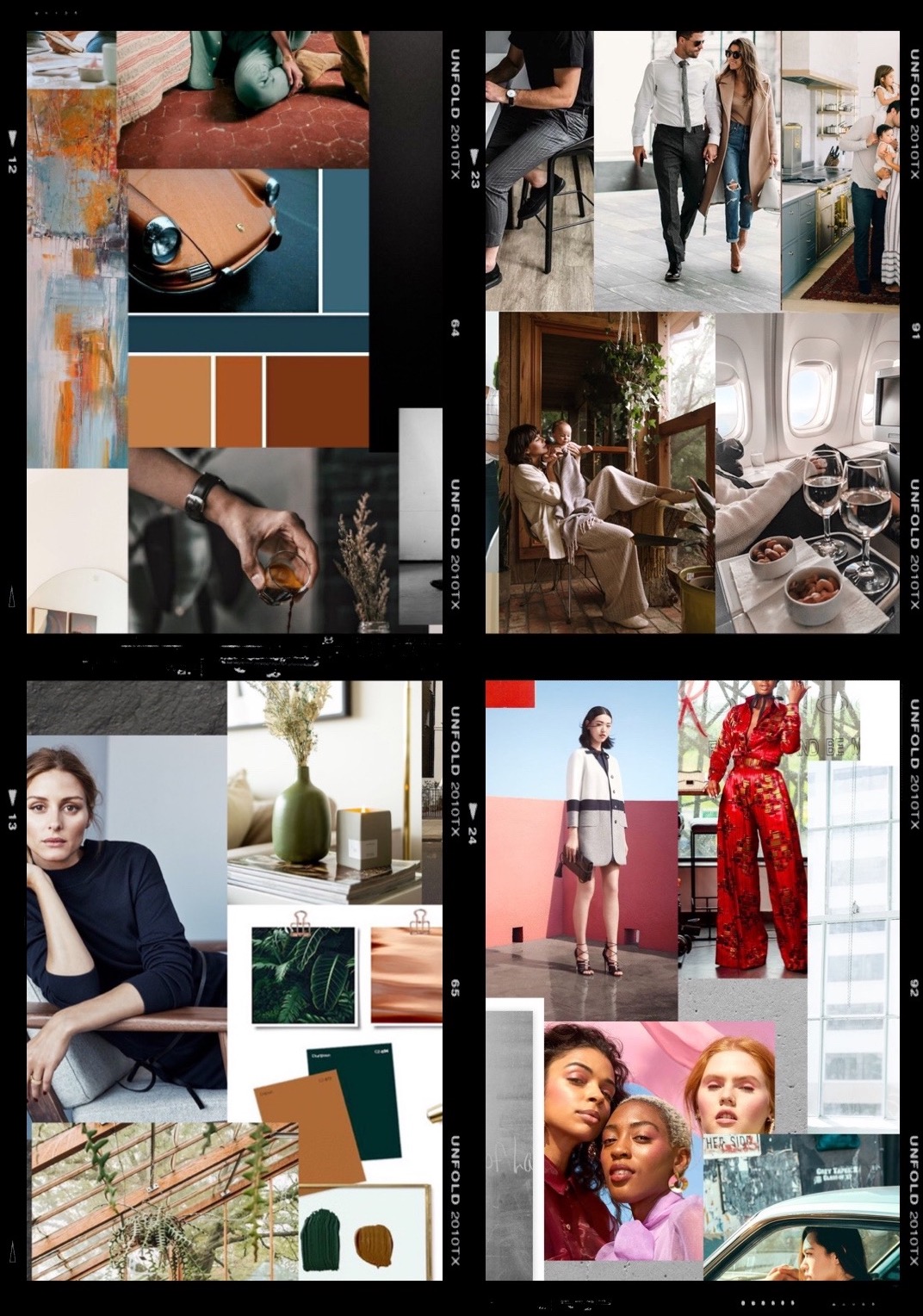
Creating an “aesthetic” on your Instagram feed is more strategic than simply finding a color and flow you like for a visually appealing presentation. There’s more to maintaining a consistent feed on Instagram than one might think, but it should be relatively simple.
Here are a few tips that work when maintaining a consistent Instagram feed:
HAVE A CONSISTENT EDITING STYLE
This can be a preset you’ve created yourself in Lightroom or by another online creative market or artist you follow. As Instagram has grown in popularity, there are plenty of ways to access those these days. We sell presets in the Rubi Z Shop online. You can also find a number of others on Etsy or Creative Market, if you’re looking for something different than what we offer. Whatever option you choose, stay consistent with it. It allows people to familiarize themselves with your brand and gives the opportunity to set the tone for what sets you apart from others.
CONSISTENT COLOR PALETTE/TONES ON YOUR INSTAGRAM FEED
Again, you’ll find that consistency is key. Finding a color palette or tones that you love when editing, whether it’s your preset or other visual representations. We are a visual society. Offering those recognizable elements to people will either attract the right people because they feel connected to your photos and what you offer or will at least familiarize them with your business brand. A key way to nail your color palette is to go on a Pinterest journey where you simply pin as many photos on a board that, like Mary Kondo says “brings you joy.” When you’ve collected several influential images, gather them and see what color tones are coming up consistently. If you find a key tone you’re drawn to, search for color palette’s with that tone. Example, search, “mint green color palette.” And you’ll begin to see some variation combos you just might love.
PLAN YOUR INSTAGRAM FEED CONTENT ON A PLANNING APP
Now that you’ve created the look and feel of your feed, planning with a visual representation through an app like Planoly will allow you to see your content put together. Designing graphics, backgrounds and other templates in Canva will also let you visualize your Instagram aesthetic. Other options, especially if you’re not looking to jump into a paying app just yet, is the Preview App.
Does it flow? Is it cohesive in the storytelling? Do the elements featured represent you in the best way possible? Does it get your brand message across? These are just a few of the questions you can ask yourself and think about as you scroll through the example of your feed.
CLOSING THOUGHTS
Maintaining the presence of your feed isn’t vital but it can represent your business when others are comparing a hundred other people just like you. It can give you a visual voice that others will not be able to forget.
If you’d like to read more about prepping your content and getting your feed ready, read “5 APPS YOU CAN USE TO PLAN, DESIGN AND CREATE YOUR SOCIAL MEDIA ON THE GO.” You can also check out our feeds on Pinterest and Instagram for more inspiration and tips.
Leave a Reply Cancel reply
You must be logged in to post a comment.
01. HOME
02. WHO WE ARE
03. SERVICES
04. PORTFOLIO
FOLLOW US
subscribe
05. THE BLOG
Stay in the know...subscribe for special offers, insider details and new releases.
sign up
© charizma co.
