about charizma co.
We are a branding and marketing agency empowering thought leaders to redefine their standard of excellence through powerful authentic branding and creative marketing approaches that deeply resonate with their target audience. With visual and written storytelling and curated content, we help them establish a recognizable and undeniable brand presence that reflects their true charisma.
02. BRANDING
01. THE LATEST
03. BUSINESS
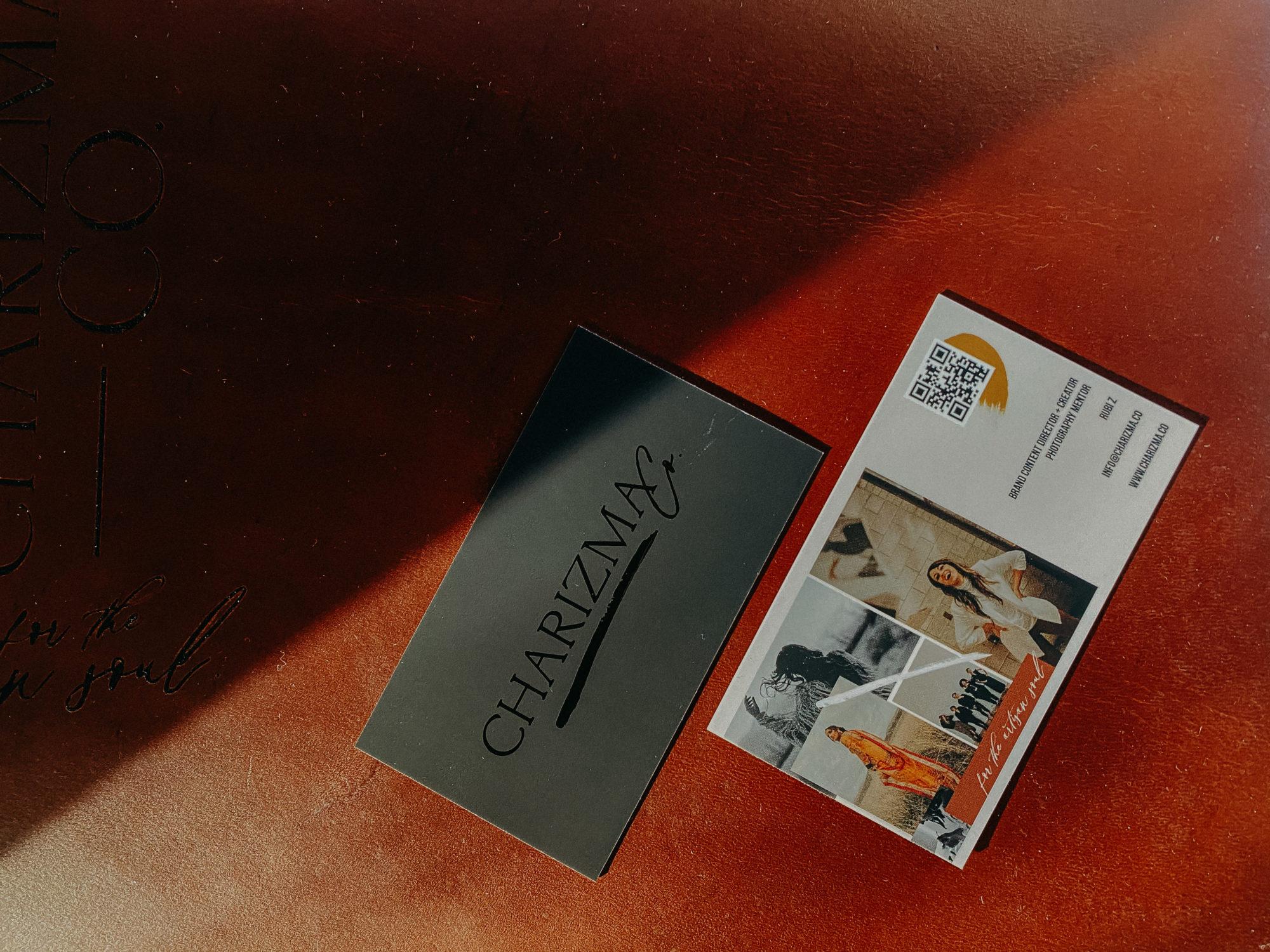
DESIGN DETAILS FROM MY RECENT BUSINESS CARD USING QR CODE AND MOO PRINTING
4/14/21
Updated my business cards. It felt like a lot of pressure to take on this design. I wanted to make my web/logo designer Leslie Vega Design, proud because her work was going to be represented.
Important things to me when designing the card was to make it simplistic, but still moving by featuring some of my work. I knew that I wanted the front to be sleek and cool and just allow the logo to shine…oh and it’s shining with the embossed black element that MOO is now carrying! I’m in love with that feature. Designing for it was a bit tricky and confusing since you have to create two different layers but overall, MOO does a great job explaining how to design.
Ever since covid, QR codes have been a more user friendly thing to use. Restaurants are using them more frequently. I myself have had a pleasant experience using QR codes when others present them. I thought it was the right time to integrate them into my business card design.
How to get your own business QR code:
- Go on this website : QR code GENERATOR [which will generate any website QR code free]
- Enter your website address in the box prompted.
- It will generate your QR code and you can then save it as a jpg or png file.
I designed my cards using Photoshop using my logo, design elements, and a few photos I’ve taken that represent the type of work I am strongest in.
I’m not an expert at designing business cards, therefore I’ll leave that to the design experts. Some things I did look out for-for myself are the following.
I wanted to make sure not to over design. I tried to keep in mind that if photos were going to be in the front then I would not do any in the back or vise versa.
I made sure the logo was the star and allowing the front of the card to just be the logo and carry a stylistic and modern touch were my top priorities.
Choosing strong photos for the card was the hardest. I love the work I produce and the people that I produce it for. I could feature every collection I’ve done [not bragging here] just really love my people. I had to just focus on the type of work I wanted to keep duplicating.
Choosing to feature my work vs featuring myself was a first for this card. That’s because Charizma Co is now more of a business that is expanding outside of myself and I wanted the work that we produce to shine more than anything else.
Finally, I wanted to make sure that the text was clear and legible but also that it didn’t overpower the photos/design. I wanted it to state exactly what I did and how they could reach me best.
Overall…love the outcome. Also, I bought a similar card style with a somewhat similar design for my shop [RUBI Z SHOP] and I printed those with Vista Print. Honestly, the outcome was really great for what it was but when compared to MOO, MOO’s quality is much better. I can tell that, although beautiful, the shop cards will wear out quicker than Charizma Co’s cards. Yet, if you like the a similar design to what I have and don’t really know how to design your own card or to do it in photoshop, going through Vista Print will be super easy.
Looking forward to handing out these new fresh cards with my new brand! Makes me so happy for the future. Also…check out a really fun REEL I did today featuring the card and QR code.
Let me know what you think of this card or QR codes themselves. Are you a fan?
Leave a Reply Cancel reply
You must be logged in to post a comment.
01. HOME
02. WHO WE ARE
03. SERVICES
04. PORTFOLIO
FOLLOW US
subscribe
05. THE BLOG
Stay in the know...subscribe for special offers, insider details and new releases.
sign up
© charizma co.

