about charizma co.
We are a branding and marketing agency empowering thought leaders to redefine their standard of excellence through powerful authentic branding and creative marketing approaches that deeply resonate with their target audience. With visual and written storytelling and curated content, we help them establish a recognizable and undeniable brand presence that reflects their true charisma.
02. BRANDING
01. THE LATEST
03. BUSINESS
Easy Tips to Create a Brand Aesthetic MOOD BOARD
3/05/21

Building a business brand aesthetic, is it important? I believe so! [I’ll touch base on a few things, but I will go into further detail about the benefits of building a brand aesthetic later].
Let’s talk about what an aesthetic means and then we will get into how to create an easy BRAND MOOD BOARD so it doesn’t have to get too complicated if you don’t have the time or know how to operate softwares needed to build an intense detailed one.
What is an aesthetic anyway? Aesthetic basically means a set of principles underlying and guiding the work of a particular artist or artistic movement. I like to particularly focus on the the word GUIDE. That’s what I believe an aesthetic does, it guides you. It guides you into making better choices and allows a more refined and focused direction. You no longer have to waste time deciding on tedious little things like what color bags are the right ones to bag your items, or what style of business cards you should go with. When you have a clear direction of your brand aesthetic, it answers those questions for you. So in part, you save a lot of time and stress. [more extremely beneficial reasons coming soon!]
Today…let’s talk logistics…HOW do you create one?! I’m pretty familiar with design [although not a designer]. I certainly have an eye for it and know enough programs through photography to get me by on the design element. Everytime I tried to share how to make a BRAND AESTHETIC using A MOOD BOARD, it seemed too complicated for those who are not as familiar with creative programs. So I decided to simply it.
Here’s how you can create your very own BRAND AESTHETIC MOOD BOARD.
- CREATE A PINTEREST MOOD BOARD. [keep it a secret] Title it “[Your Business] Mood”
- GO ON A PINNING JOURNEY. Don’t rush this process but have fun with it. It’s as equivalent as if you could have a shopping spree, travel anywhere, and design your home the way you want without paying for it. That’s the journey you should take. Like window shopping or putting everything into a basket that you would love to buy and have. LOL. Ok, extreme here, but seriously. Express your TASTE and STYLE through this pinning experience and go crazy.
- DOWNLOAD 10-15 IMAGES TO YOUR PHONE. After you’ve gone on your pinning experience, you’ll want to review it all and then save about 15-20 of your absolute favorite images, those that speak your style and taste more than any others. Save them to your phone photo library.
- SCREENSHOT YOUR PHOTO LIBRARY [where the downloaded images are]. So you’ve saved them and you should now see a few squares worth of those freshly saved images. You will want to screenshot your phone photos to make up one photo with a grid of the images you saved.
- UPLOAD THE SCREENSHOT TO INSTAGRAM STORIES. Ok, this does not mean you’ll be posting…we are going to do a little art design trick in stories. Upload the screenshot photo. Make sure you have it lined up where you no longer see the elements of it being a screenshot.
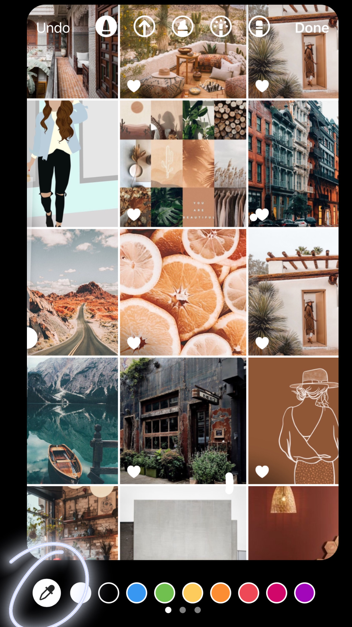
- THE DRAWING [DROPPER] TOOL. At the top of the options bar in your stories, there is a tool that looks like a squiggly line, that is your drawing tool. Select that tool. Once selected you’ll see several circle colors appear at the bottom of your screen. To the far left you’ll see an icon that looks like a dropper. Tap on it to select and then you’ll see a bubble, as you move your finger around, it is picking up the color tones you’re selecting in the image. You basically want to find LEADING COLORS. Select 4-5 key colors that seem to be consistent in your screen shot.

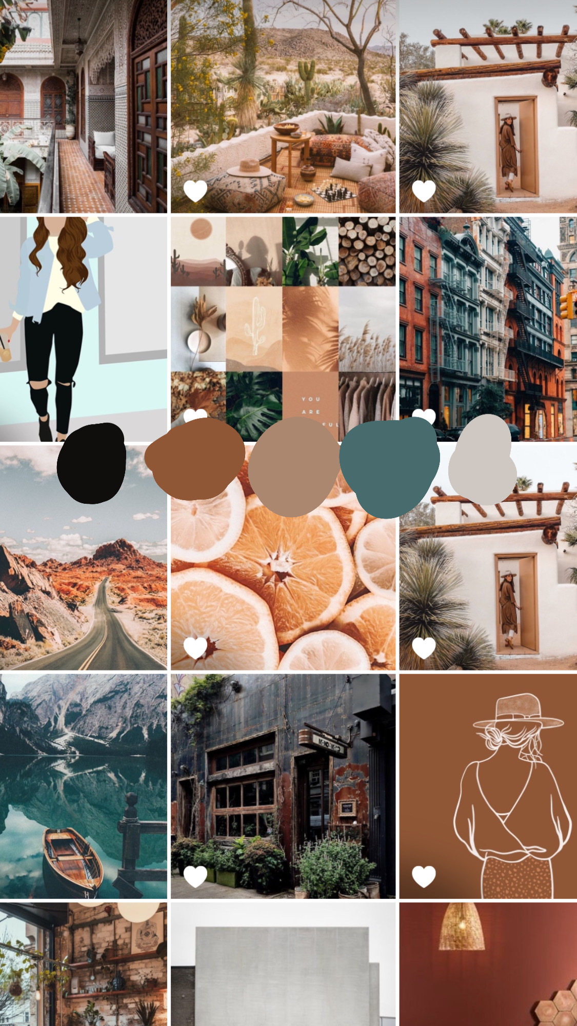
7. FORM YOUR COLOR PALETTE. You’ll need to do this part one at a time by mapping out the consistent color. Once it picks up the color you want, begin to swab a sample circle of it on the grid of your screenshot, this doesn’t have to be perfect. Repeat this for your 4-5 colors. I suggest not going past 5 or else you continue to not have a concise brand aesthetic.

8. DOWNLOAD AND SAVE. Do not post this, this is for you to know and keep at the forefront of your mind. Well you can post it if you want to share it with the world [dont’ forget to tag me @charizma.co so I can see how yours turned out and we can celebrate together!]. MOST IMPORTANTLY remember to download it and save it to your photos!
9. PRINT IT. I recommend you print it and put it up on your wall or near your working station so that you become familiar with your brand aesthetic moving forward.
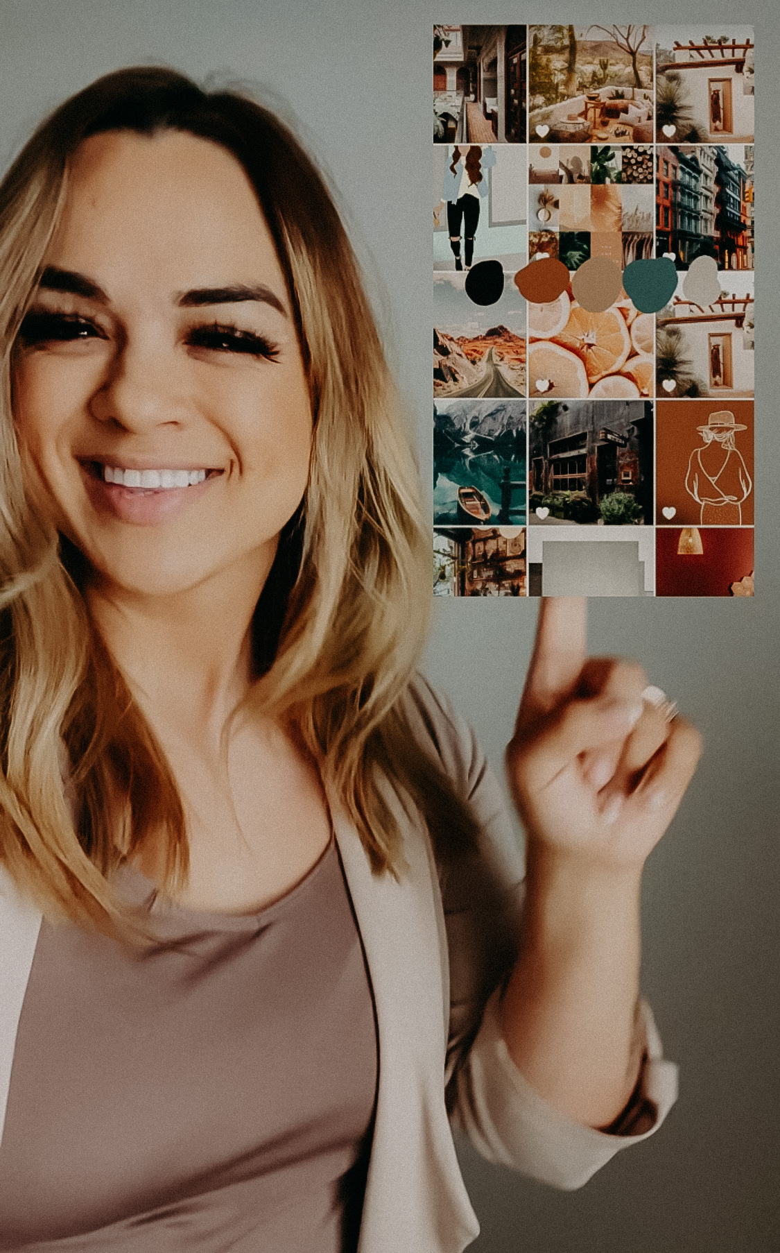
Want a quick visual representation of what I did, check out my instagram reel HERE.
WHAT CAN YOU DO WITH THIS KNOWLEDGE of your new brand aesthetic….I CAN’T WAIT TO SHARE next week! Stay tuned.
Leave a Reply Cancel reply
You must be logged in to post a comment.
01. HOME
02. WHO WE ARE
03. SERVICES
04. PORTFOLIO
FOLLOW US
subscribe
05. THE BLOG
Stay in the know...subscribe for special offers, insider details and new releases.
sign up
© charizma co.
